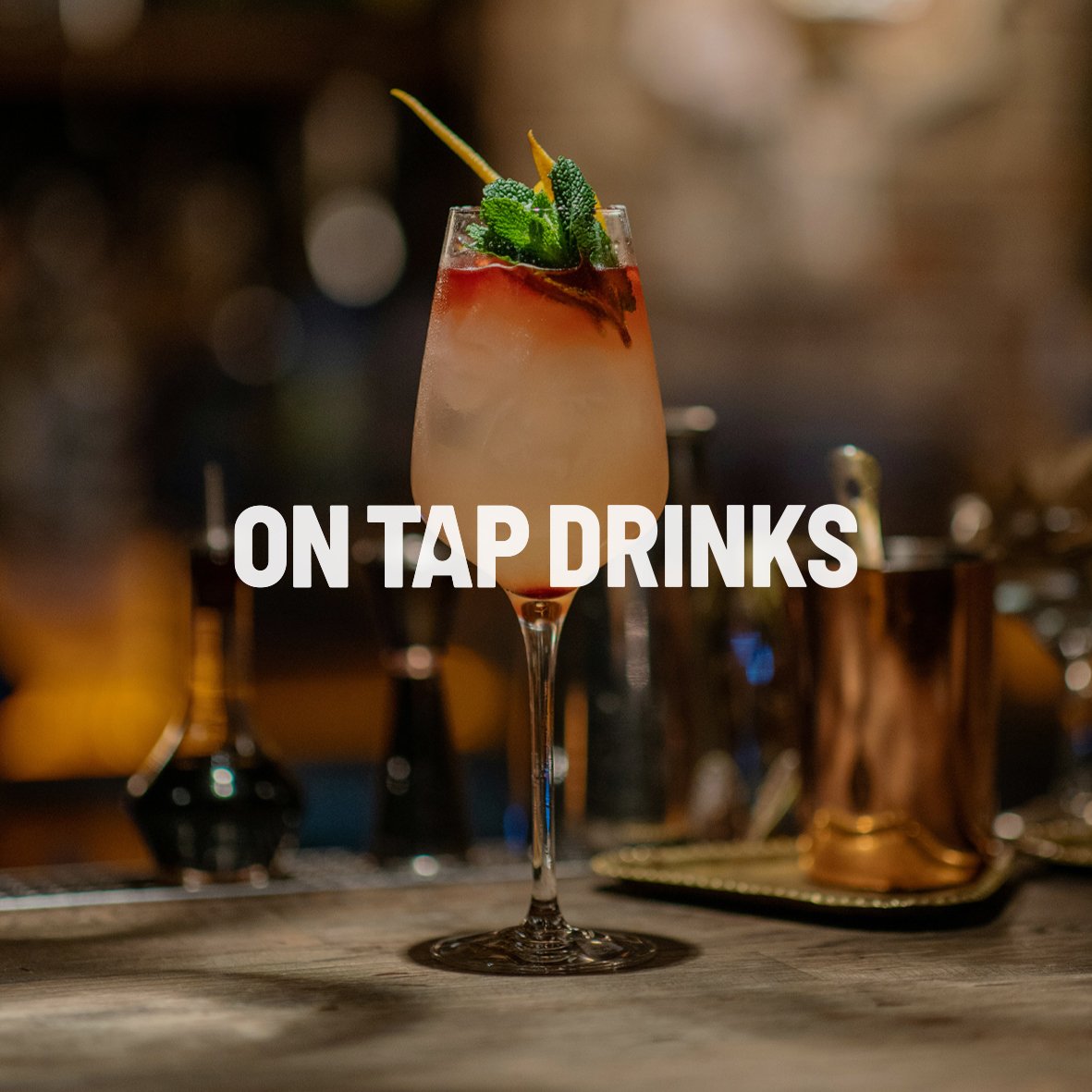
Designing a visual identity that brings Shack Events’ cocktails to life across the UK’s biggest events.
LOGO DESIGN I BRANDING I PACKAGING DESIGN
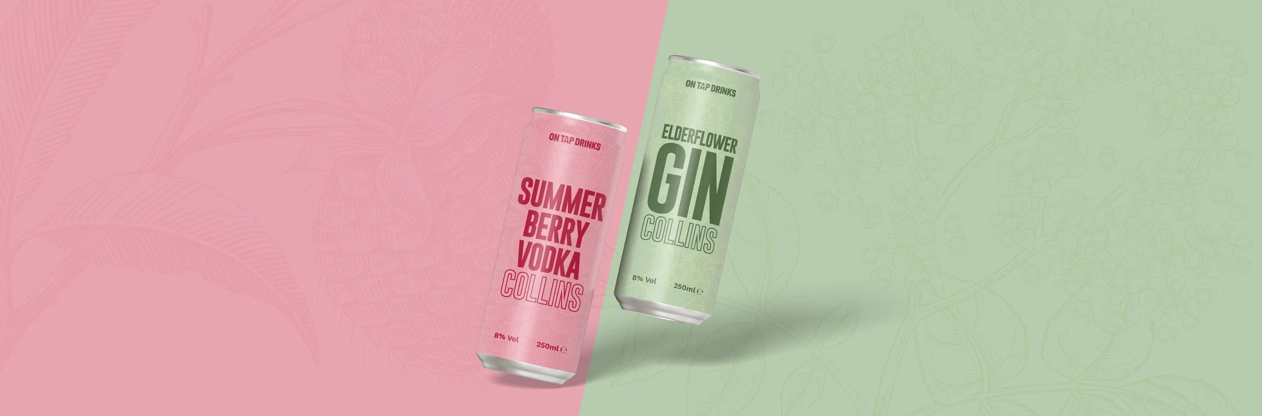
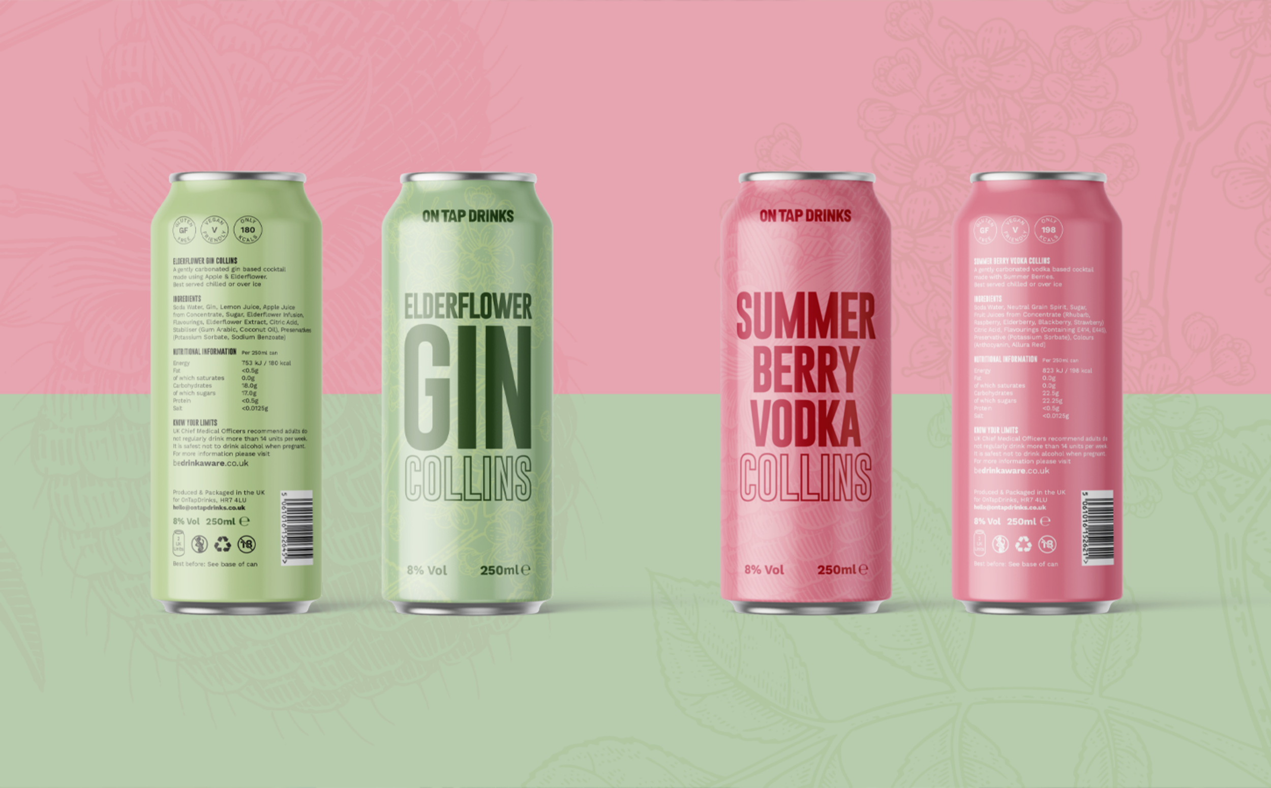
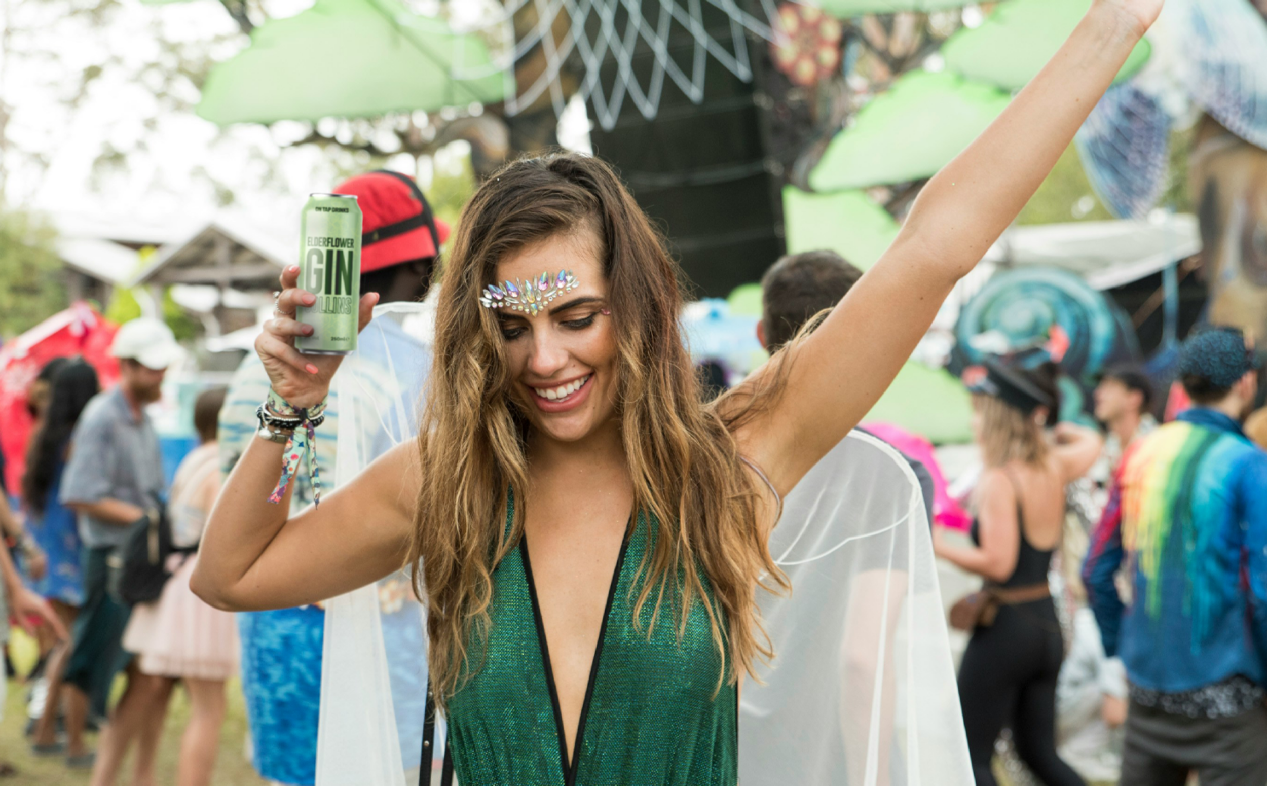
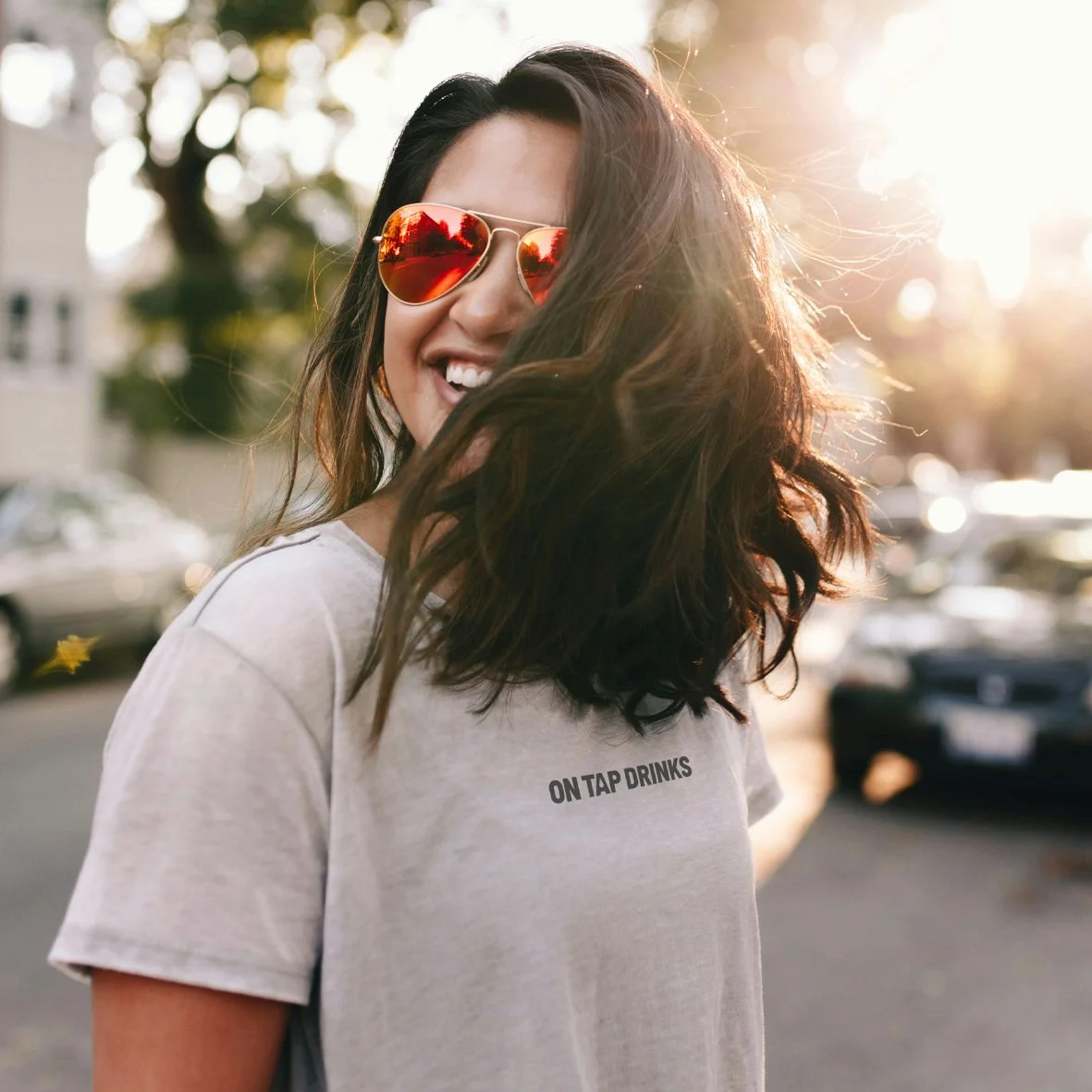
Shack Events wanted a bold, exciting brand for their new canned cocktail range, On Tap Drinks. They needed a design that would stand out at the UK’s biggest events and festivals, capture the energy of their bars, and feel fresh, fun, and instantly recognisable across cans, signage and social media.
The Problem:
New Product, No Visual Identity:
Although Shack Events had a strong reputation for festival bars, their canned cocktails needed a brand that would feel equally confident and memorable.
Need for Shelf Appeal:
The cans needed to stand out on site and online, grabbing attention with clear messaging and vibrant visuals.
Limited Branding Guidelines:
Without a cohesive identity, it would be difficult to maintain consistency across packaging and marketing materials.
The Solution:
Logo Design:
We created a bold and simple logo for On Tap Drinks that could be instantly recognisable across cans, signage, and digital channels.
Can Design:
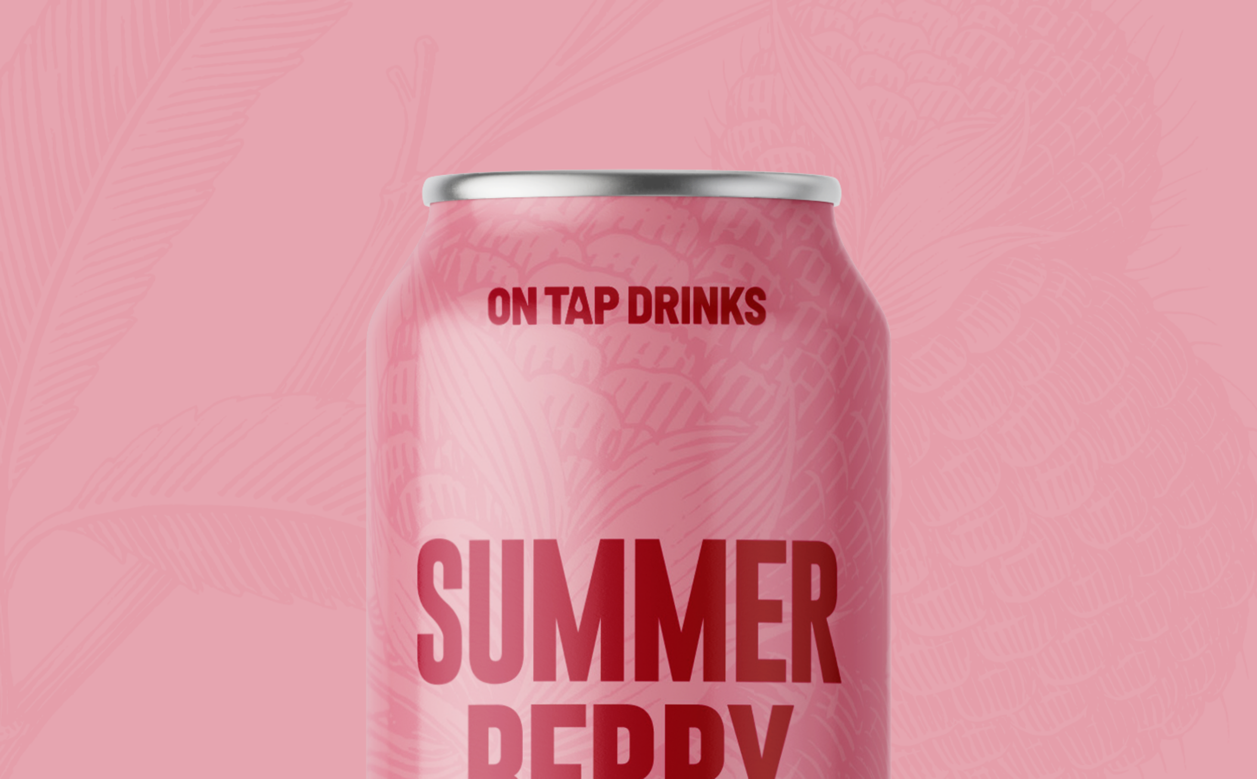
Using a fresh, colourful palette and bold, clear typography, we designed cans that instantly grab attention on site and online. Each flavour has its own distinctive look while maintaining a cohesive brand identity, making the range feel playful and energetic.
Consistent Brand Language:
All material, from cans to marketing assets, follow a unified visual system, ensuring the product feels connected to Shack Events’ larger brand while standing out on its own.
“
Working with Simon to create the OnTap logo and can design was a seamless experience, he captured all that we asked for and was able to work within our tight timelines to push this project over the line
RICHARD MANNING, SHACK EVENTS