Crafting a visual identity that unites communities behind Herefordshire’s nature recovery goals.
LOGO DESIGN I BRANDING I PRINT DESIGN
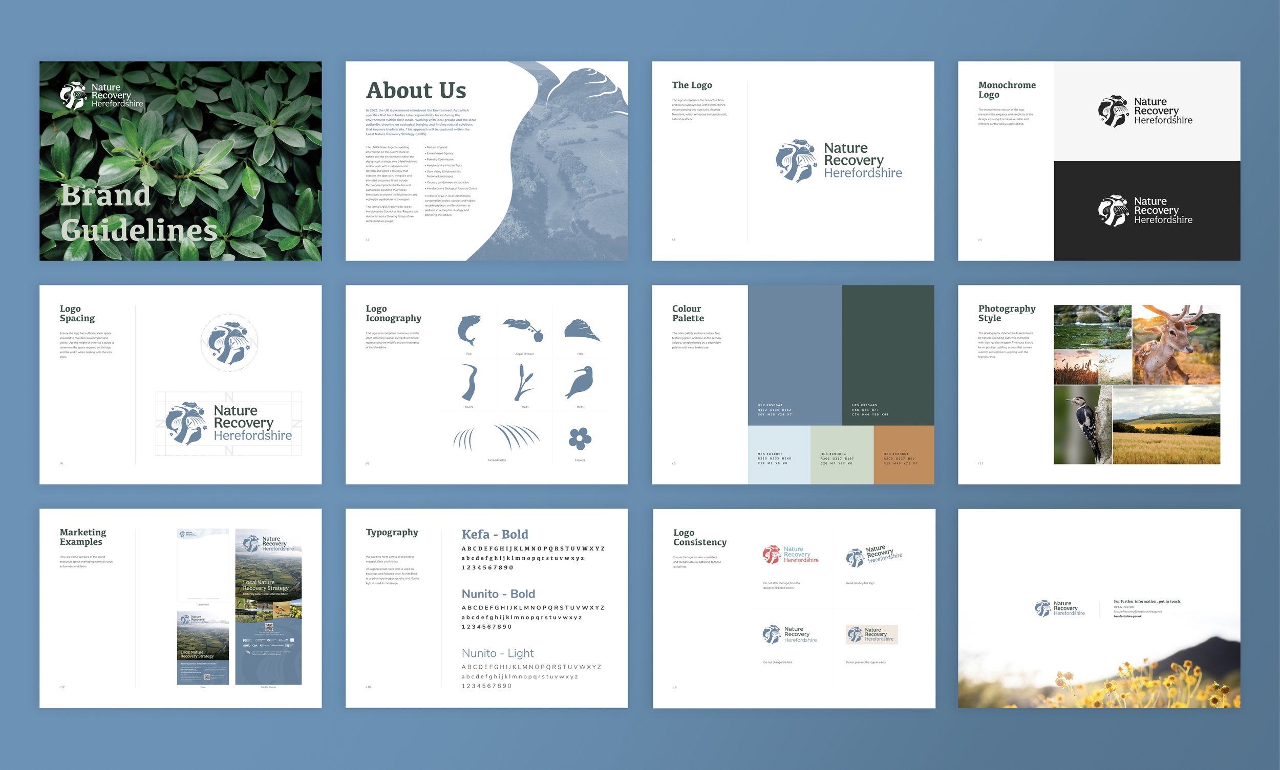
Herefordshire Council wanted a clear, engaging brand for their Local Nature Recovery Strategy. The aim was to inspire communities and partners to take action to restore biodiversity, while bringing consistency and clarity to all their printed and digital materials.
The Problem:
Fragmented Environmental Messaging:
Existing materials lacked a cohesive visual identity, making it challenging to communicate the strategy’s goals effectively.
Need for Public Engagement:
To restore biodiversity and balance, it was essential to engage local communities and stakeholders in the recovery efforts.
Underutilised Resources:
The strategy’s potential was limited by the absence of a unified brand to promote and support its initiatives.
The Solution:
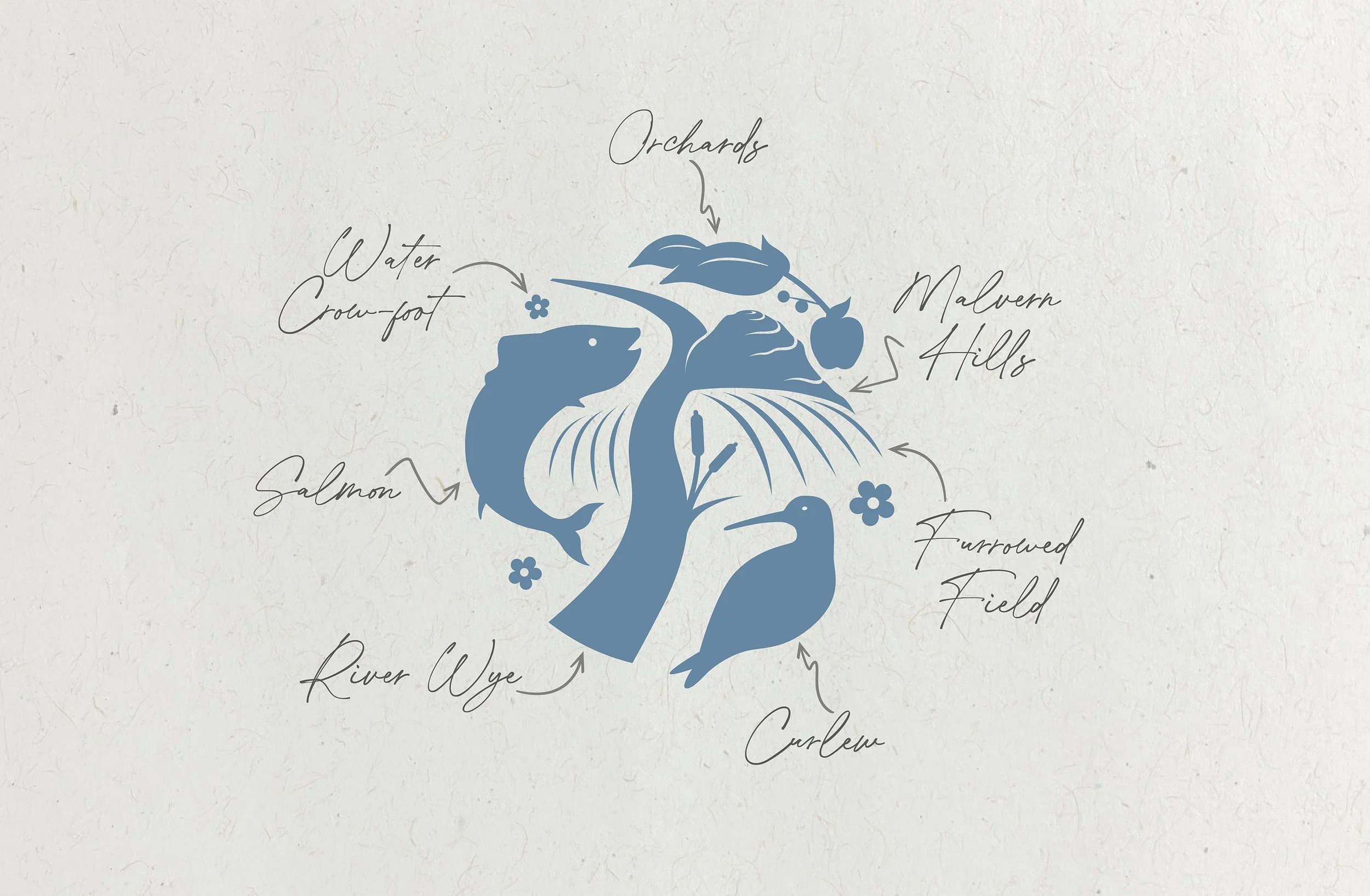
Logo Design:
We crafted a logo that symbolises the interconnectedness of nature, reflecting the strategy’s holistic approach to environmental recovery.
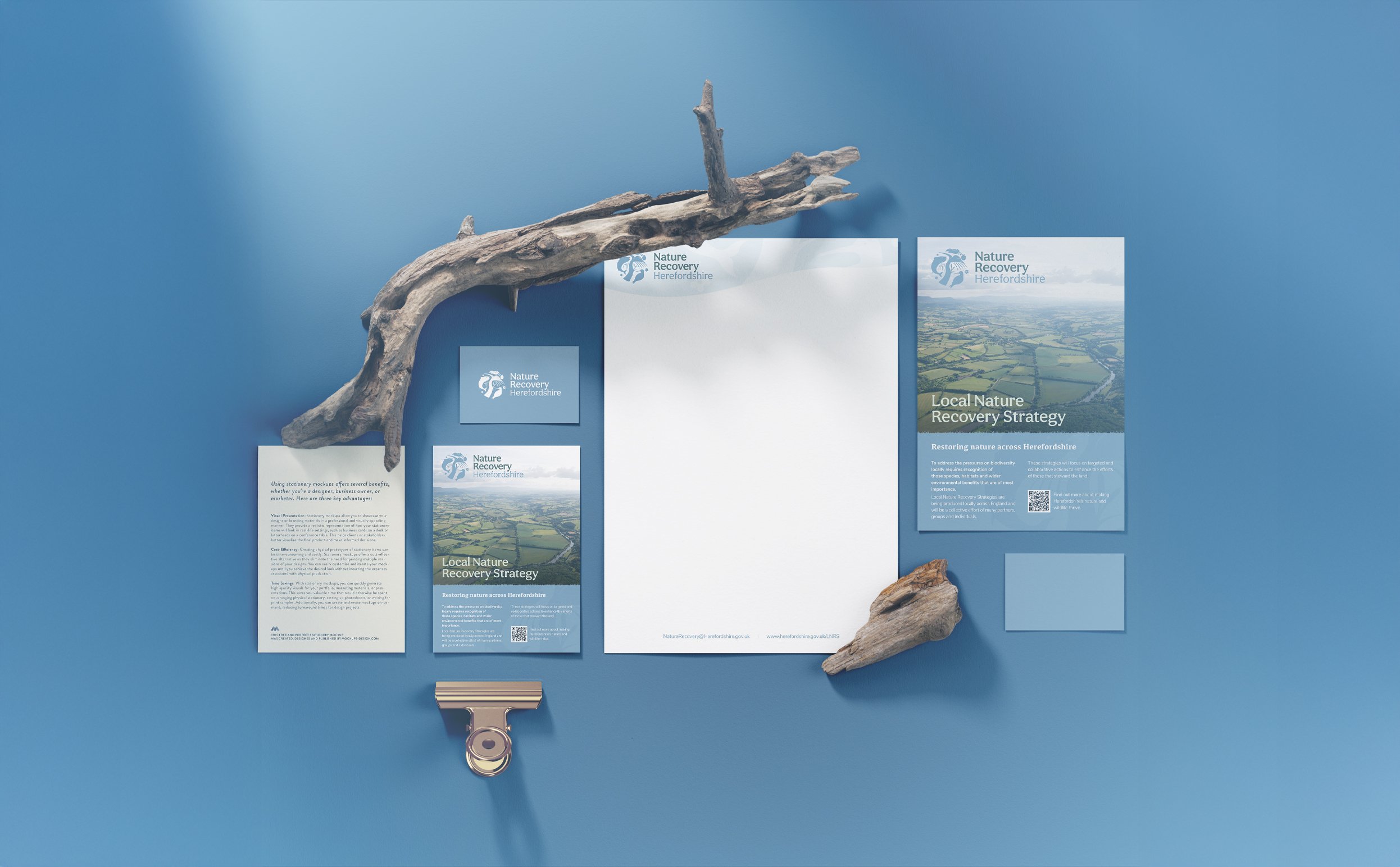
Brand Guide:
A comprehensive brand guide was developed to ensure consistency across all materials, reinforcing the strategy’s identity and message.
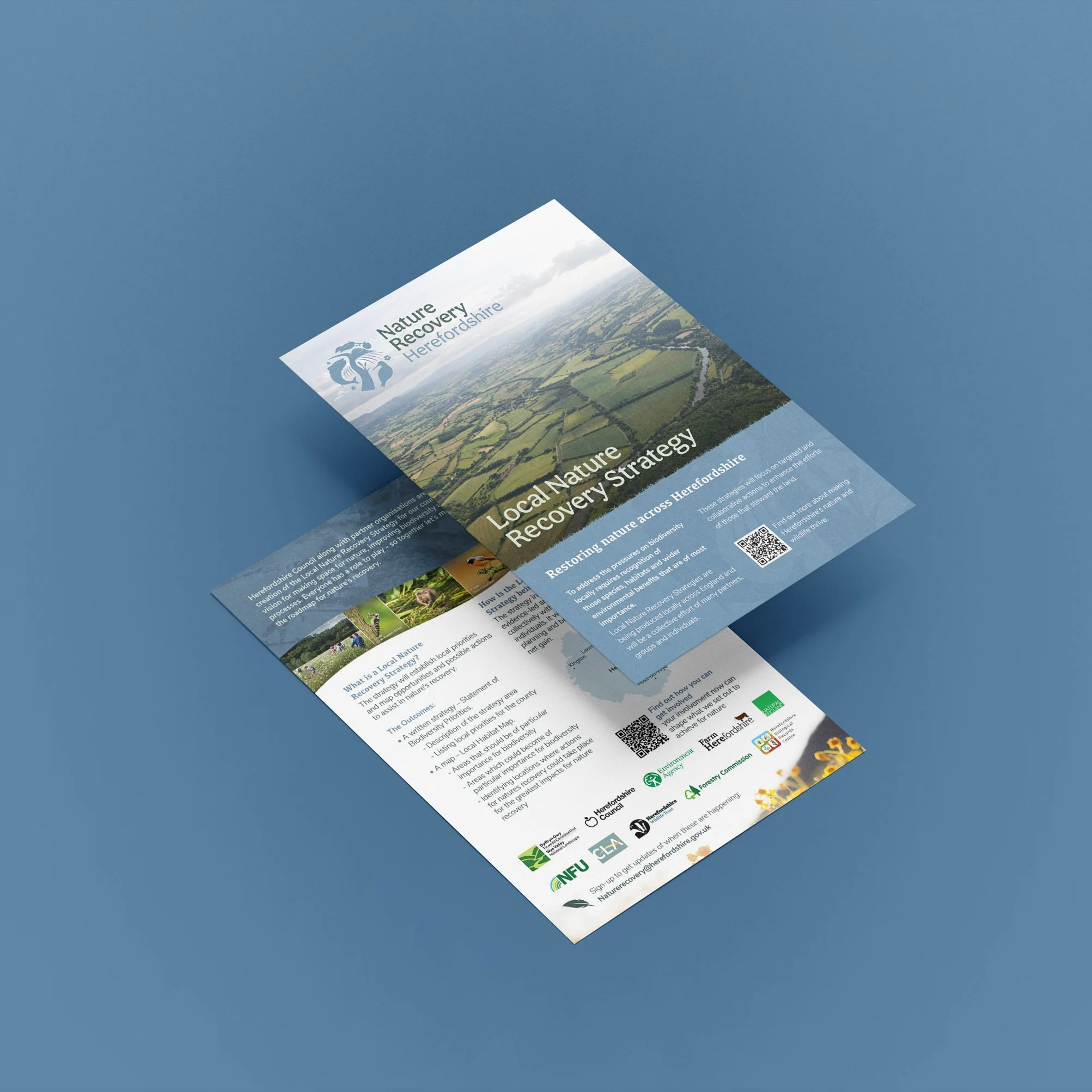
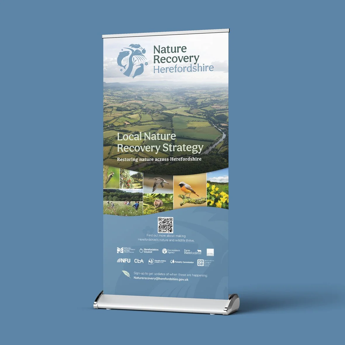
Printed Materials:
We designed pull-up banners and flyers to promote the strategy at events and community gatherings, increasing visibility and encouraging participation.