Shaping Hereford FC’s matchday experience through engaging programme design.
BROCHURE DESIGN I PRINT DESIGN
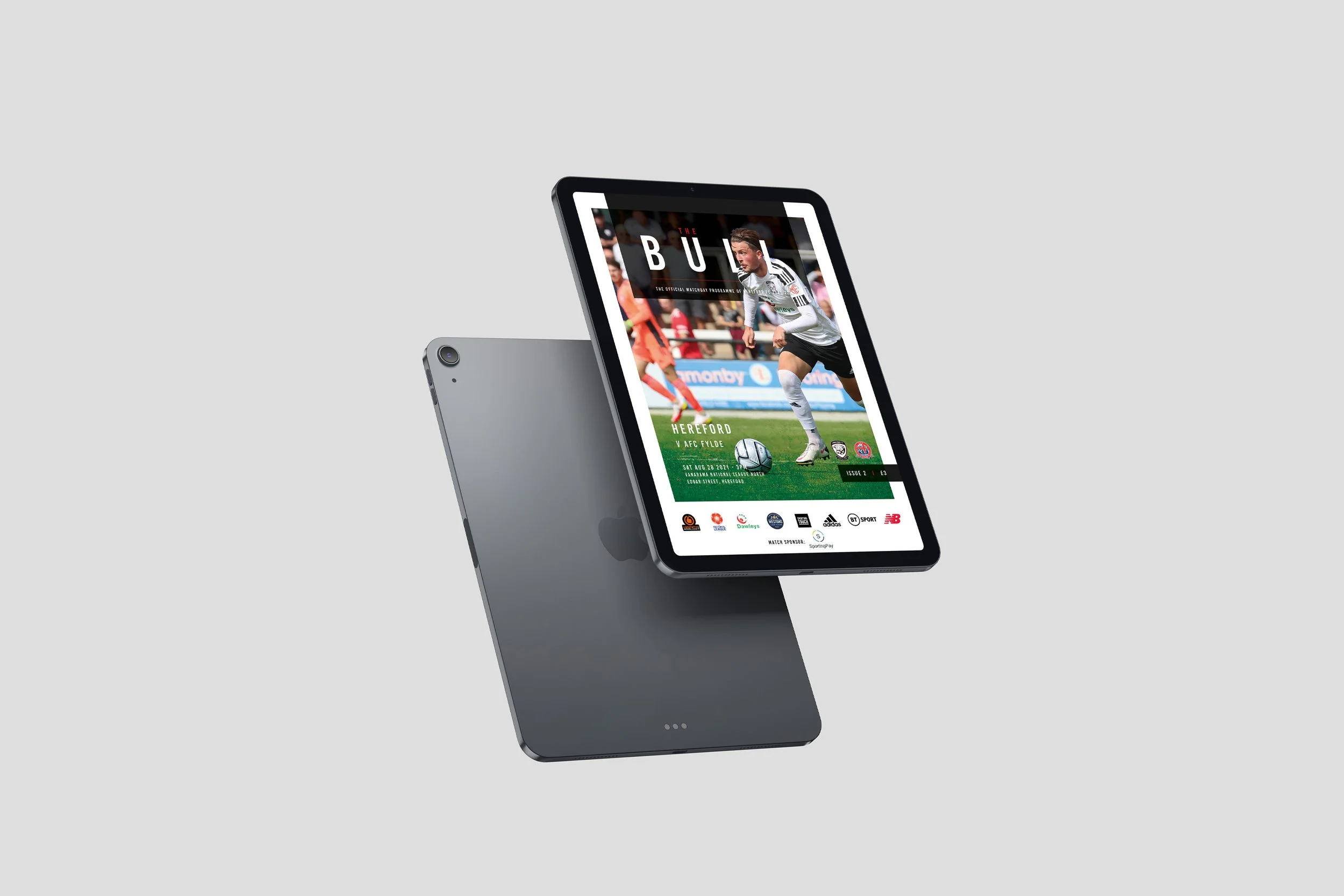
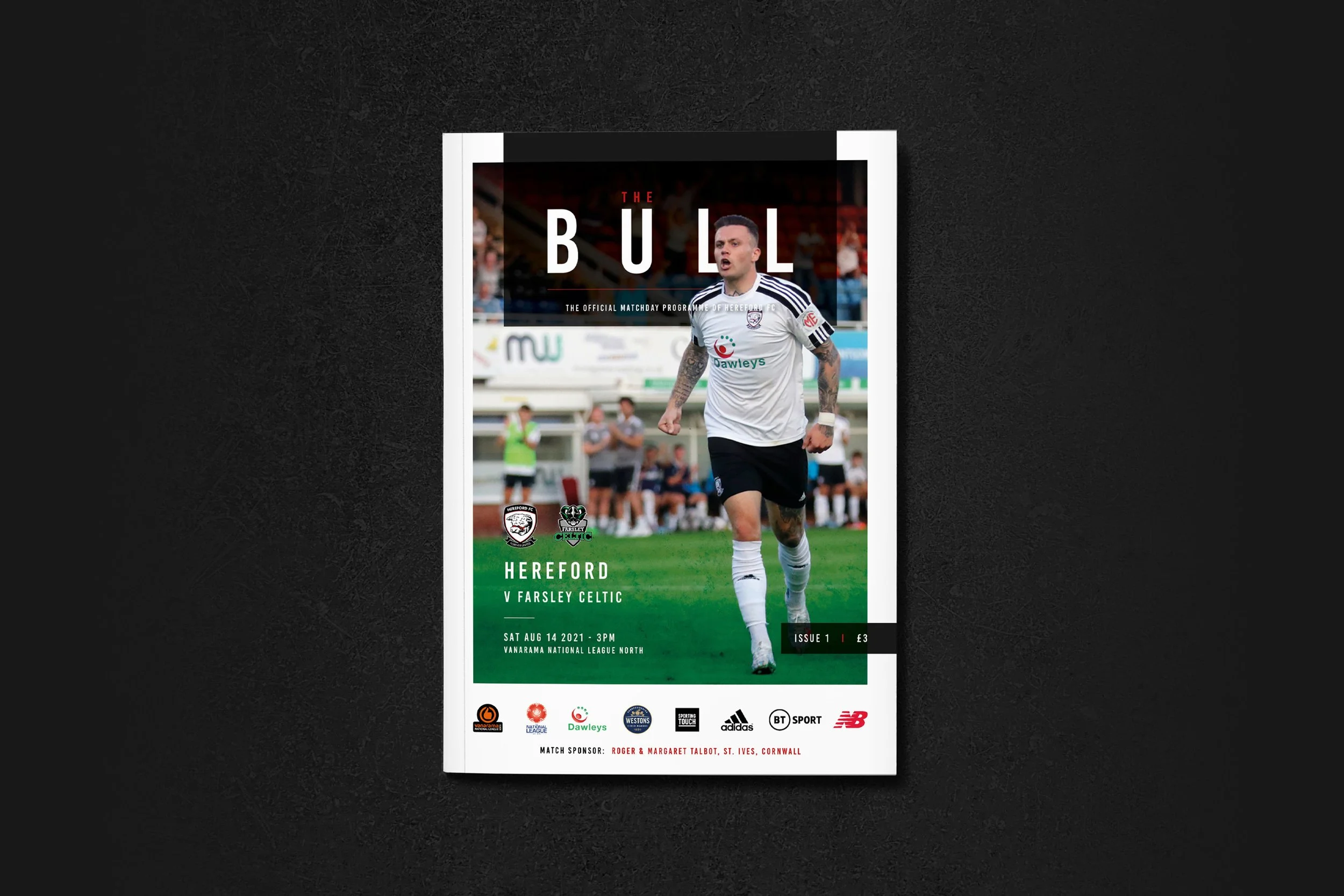
Hereford FC wanted a matchday programme that was clear, and engaging. Their previous programme was busy, with lots of info, ads, and stats that made it hard for fans to follow. The aim was to create something that looked appealing, organised the content effectively, and made the matchday experience more enjoyable.
The Problem:
Overcrowded Layout:
The previous programme was packed with information, stats and ads, making it difficult for fans to find what they were looking for. Important matchday content often got lost in the clutter.
Lack of Visual Appeal:
The design didn’t reflect the excitement of matchday or capture the energy and identity of Hereford FC, leaving the programme feeling flat and uninviting.
Inconsistent Styling:
Colours, fonts, and layouts varied throughout, creating a disjointed experience that undermined the club’s brand.
The Solution:
Programme Redesign:
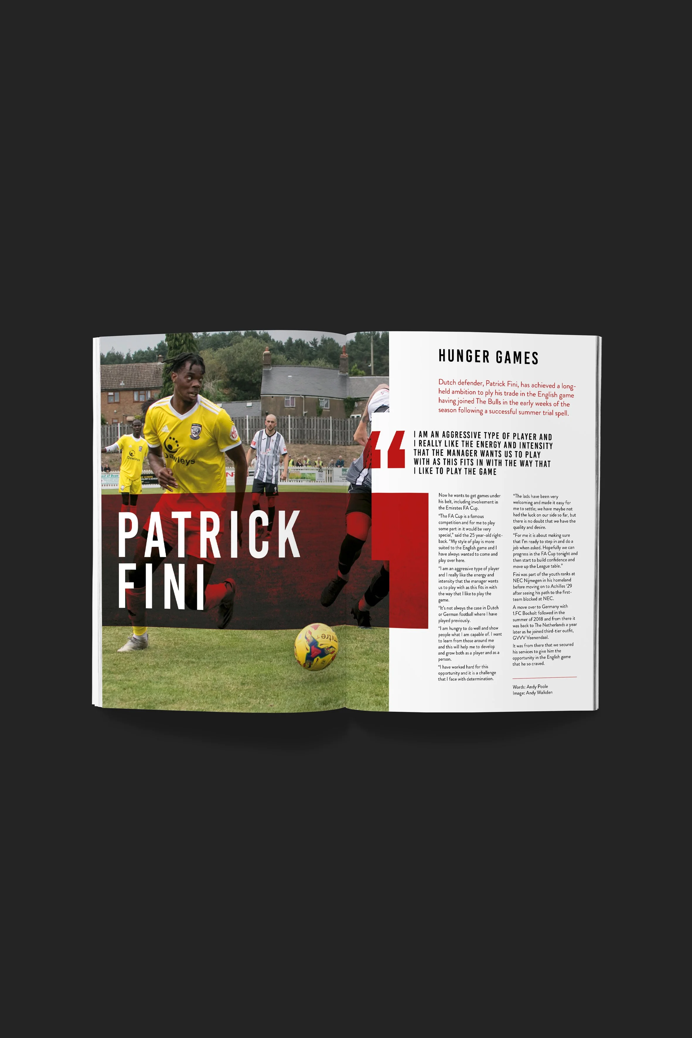
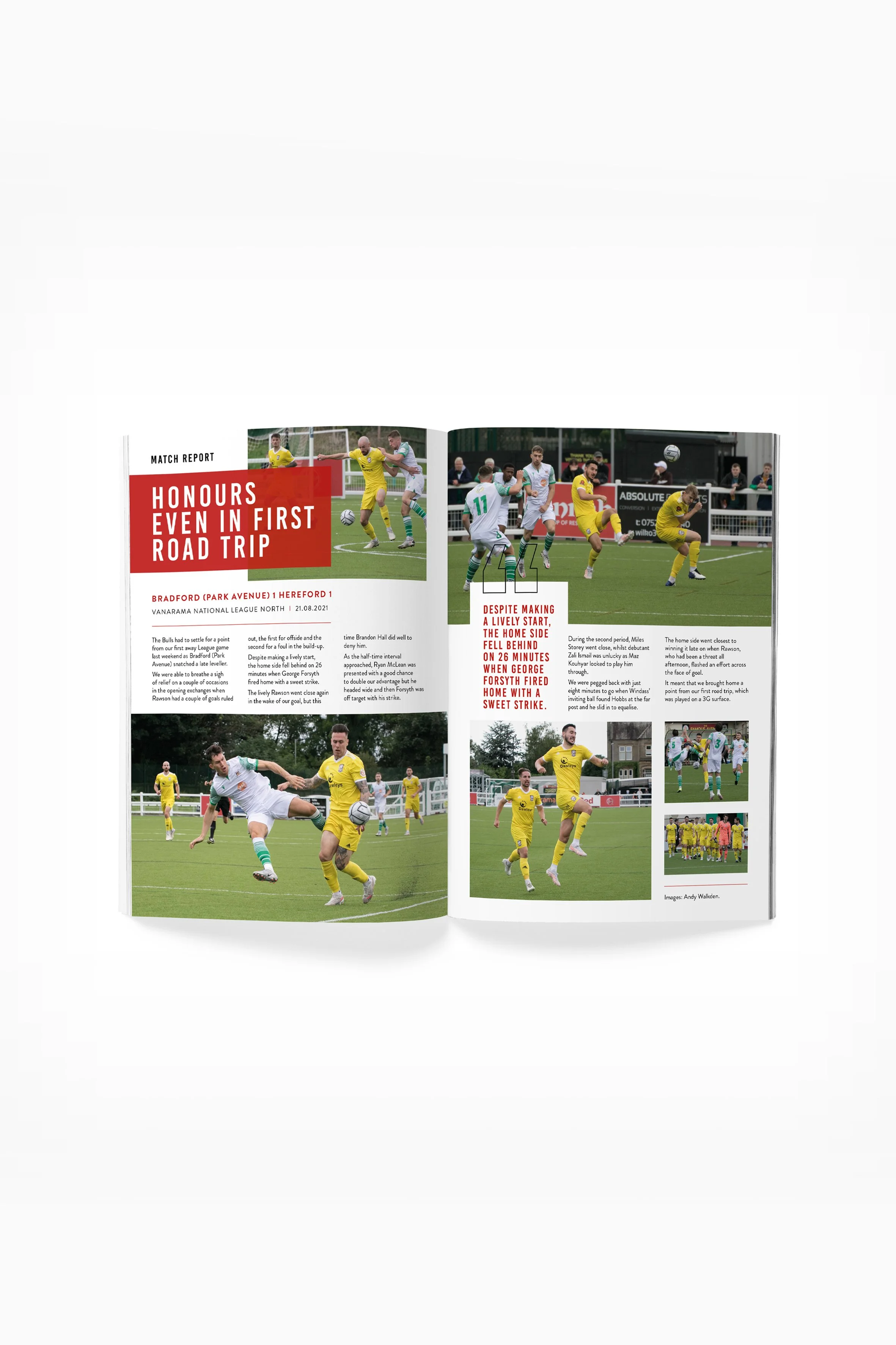
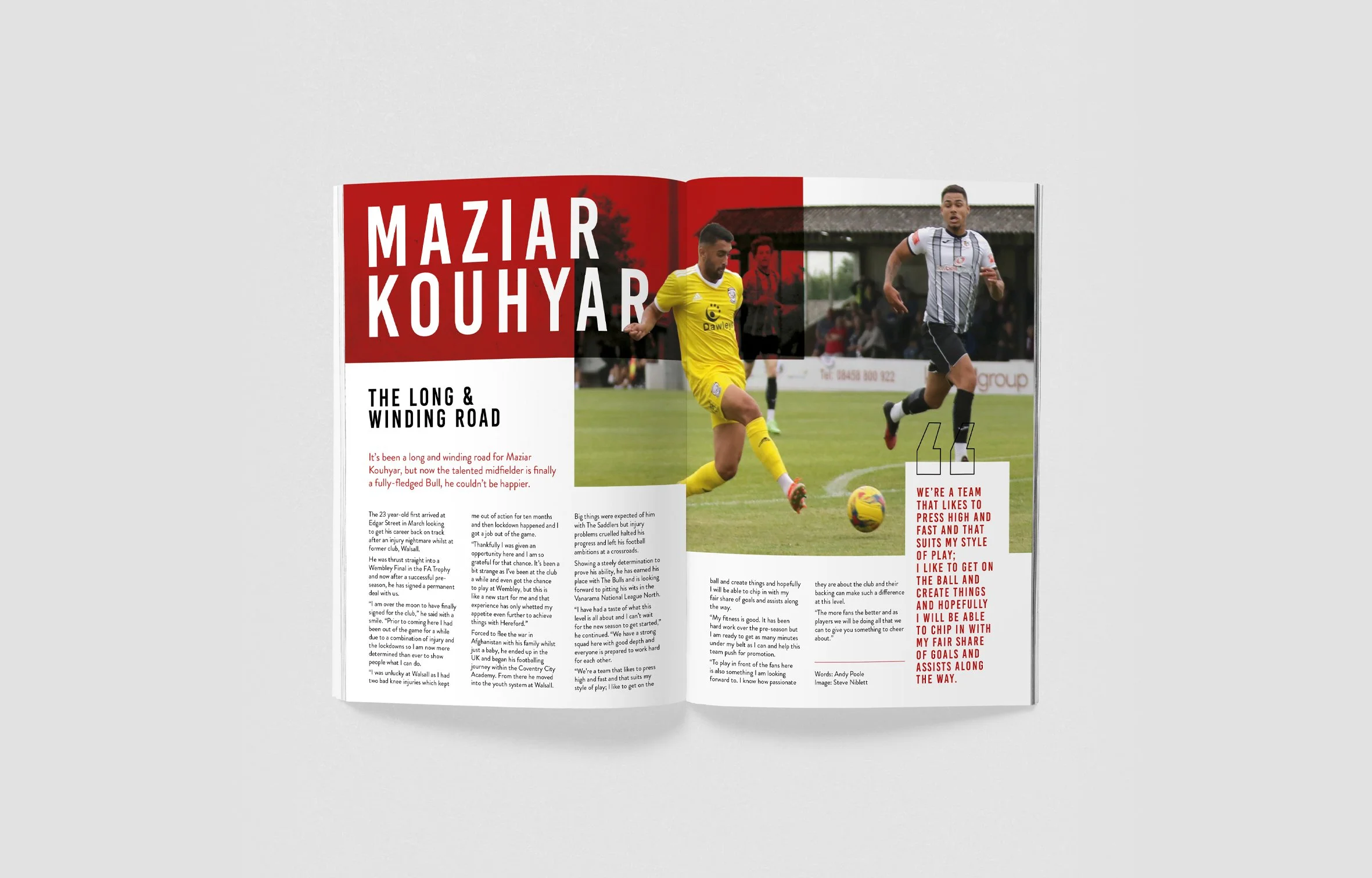
We completely overhauled the layout, organising content clearly and giving each section its own space, making it easy for fans to find fixtures, stats, and team news at a glance.
Visual Hierarchy and Typography:
By introducing a consistent typographic system and hierarchy, fans can now navigate stats, articles, and ads with ease.
Engaging Design:
The new programme balances informative content with visual appeal, making it a must-read for fans on and off matchday.