Strengthening John Finch Computers' identity to match the reliable, forward-thinking service they deliver every day.
BROCHURE DESIGN I BRANDING I BRAND GUIDELINES I VISUAL IDENTITY
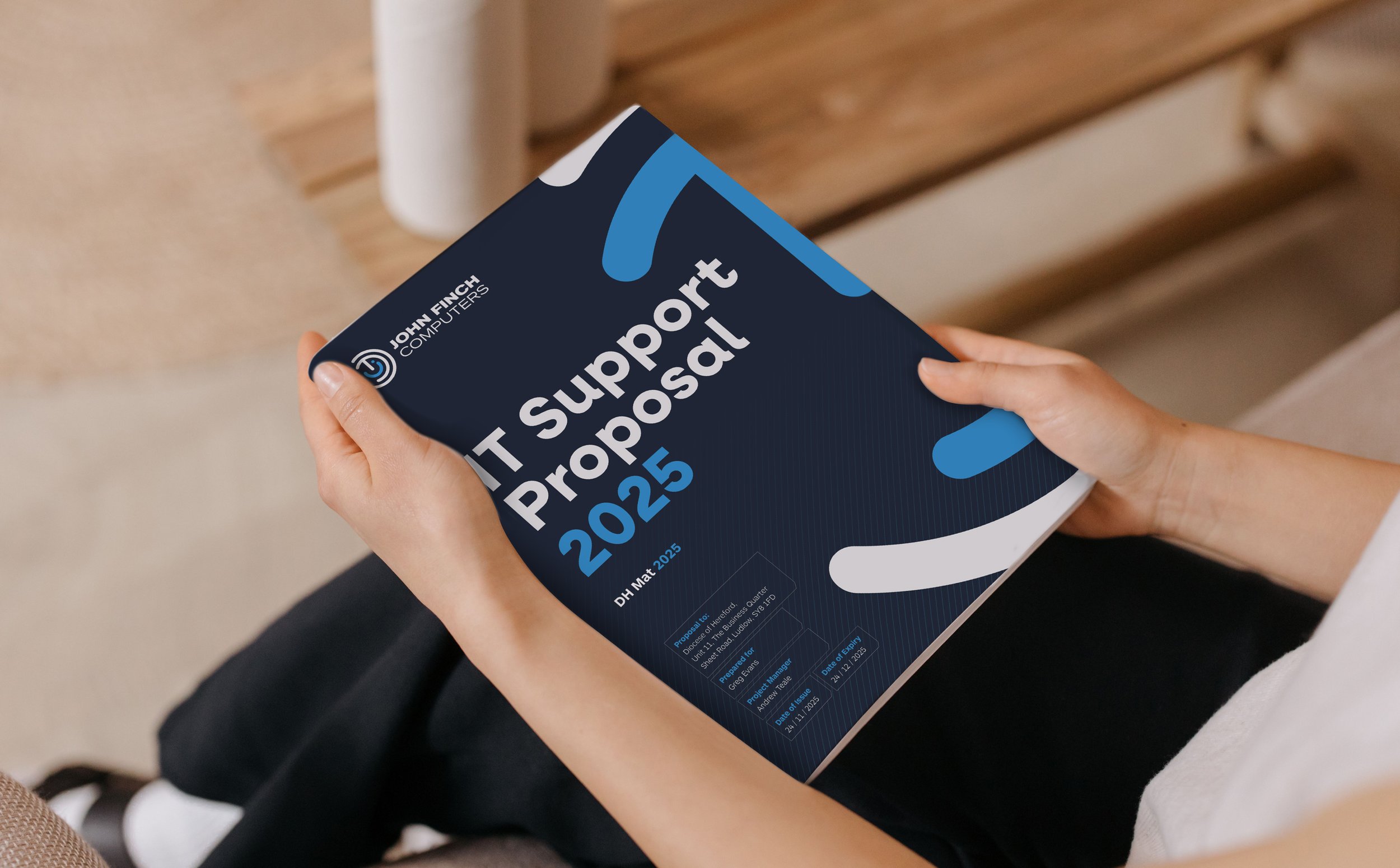
John Finch Computers needed a brand that felt as consistent and dependable as the service they'd built their reputation on. With a solid logo already in place, the focus wasn't on reinvention but on bringing everything into line, creating a structured brand guide that would carry their identity clearly and confidently across every piece of print and digital communication.
The Problem:
Inconsistent Materials, Wasted Time:
Every leaflet, flyer, and brochure was being designed from scratch, with no shared system to work from. This meant time was spent reinventing layouts and style choices for every new piece rather than simply applying an existing structure.
A Logo Without Guidelines:
The John Finch Computers logo was solid, but with no brand guide behind it, there was nothing to dictate how it should be used consistently, no defined colours, typography, or layout rules to keep things aligned.
A Fragmented Look Across Touchpoints:
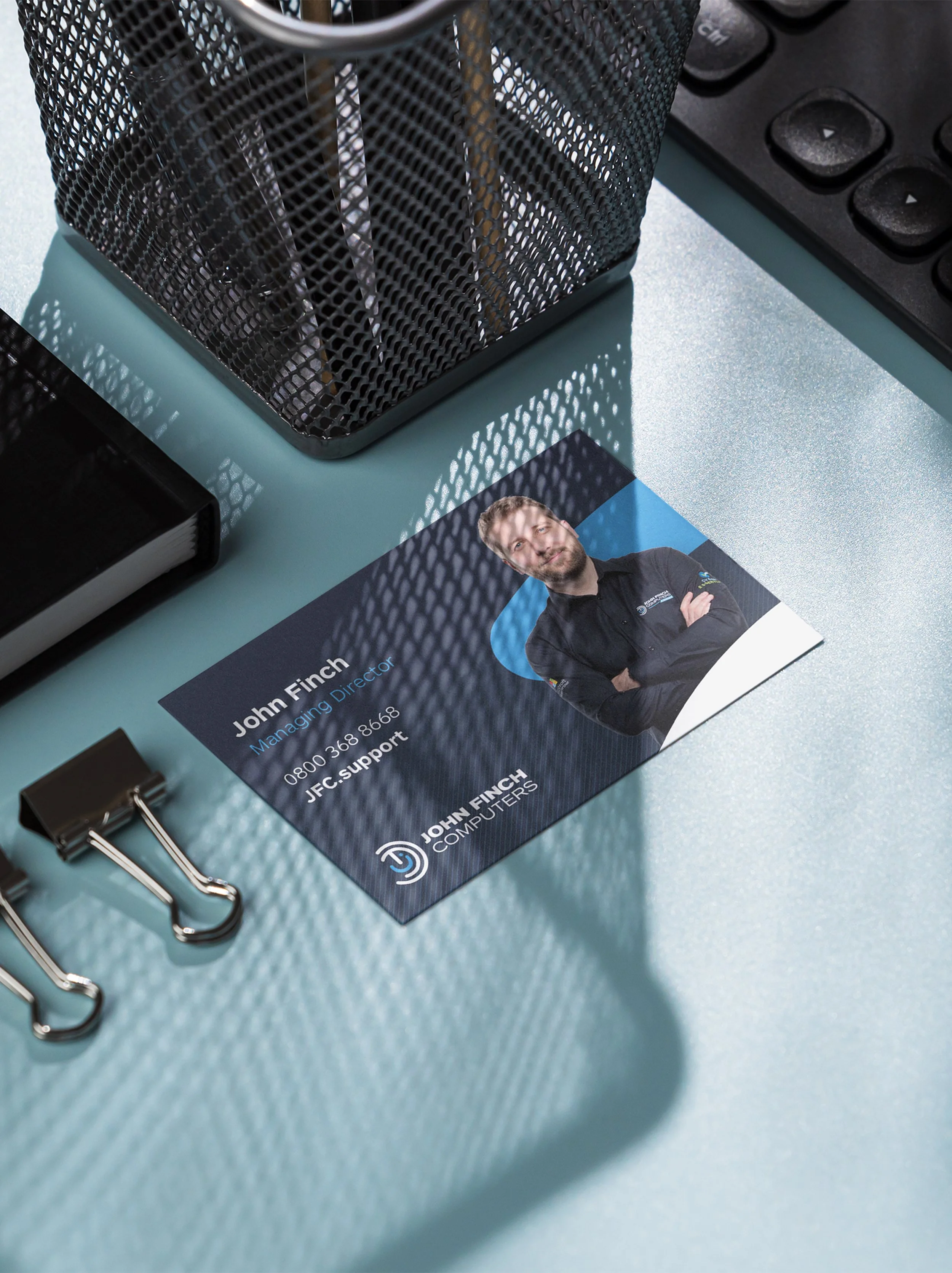
Business cards, email signatures, and printed materials had each developed their own look over time. Without a cohesive identity, the various pieces of communication didn't feel like they belonged to the same company.
The Solution:
Logo Refinement:
Rather than a full redesign, we made subtle, considered tweaks to the existing John Finch Computers logo, sharpening its details and proportions so it felt more polished and professional while still remaining instantly recognisable to existing clients.
Brand Guide:
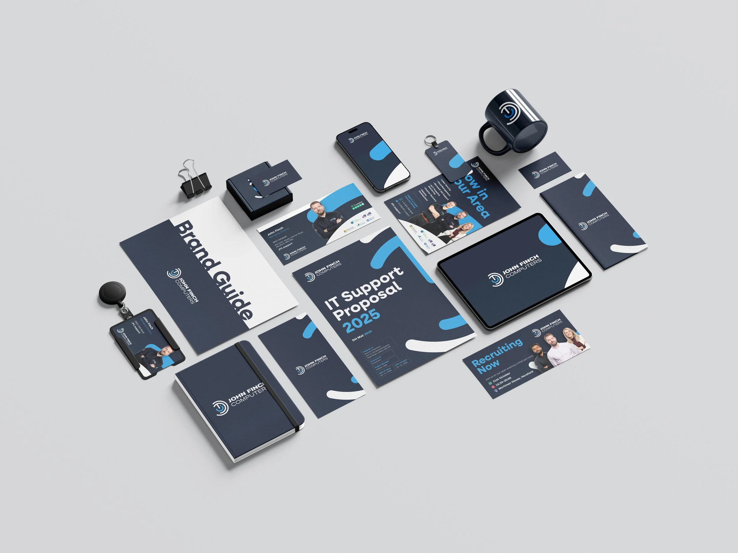
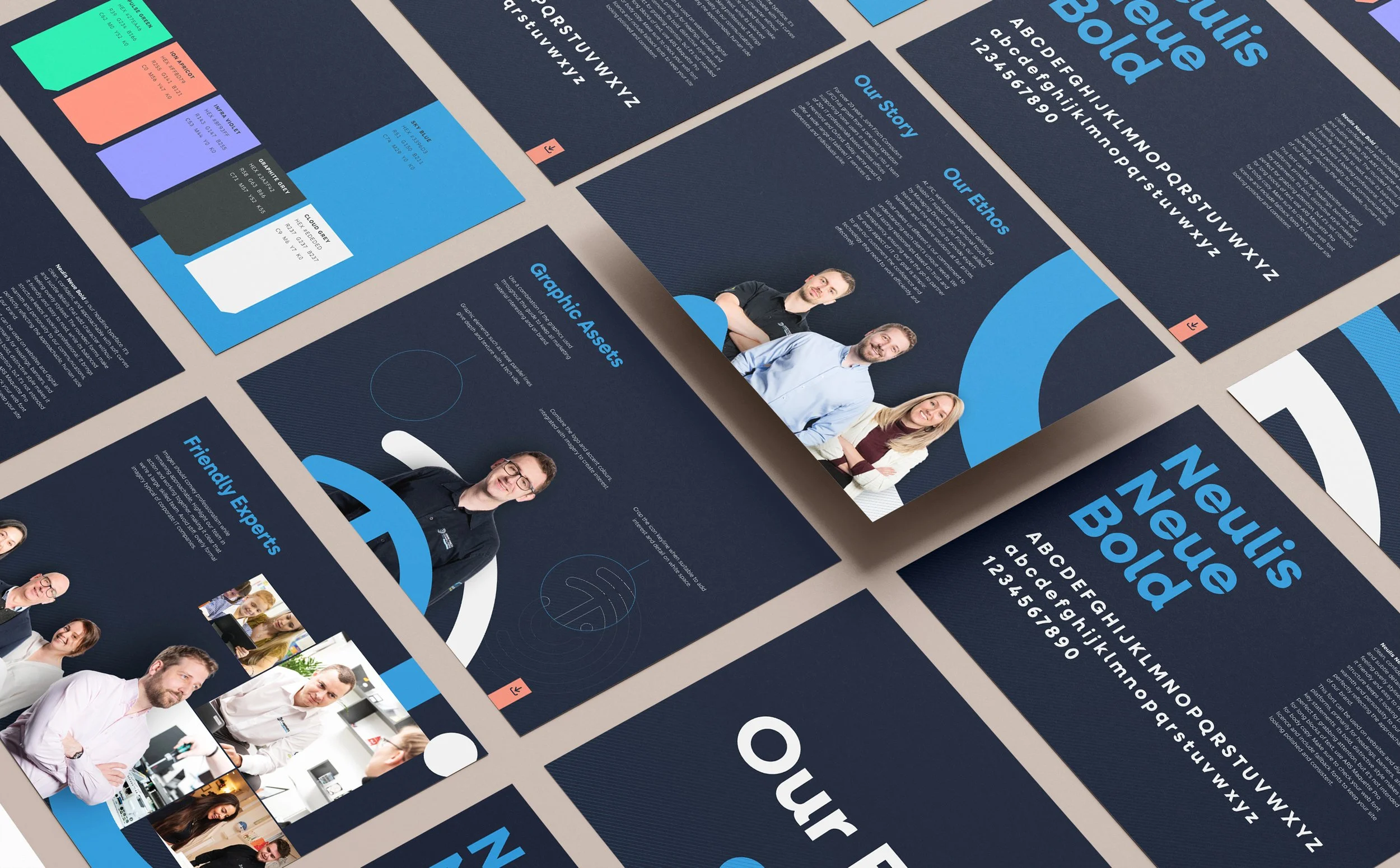
A comprehensive brand guide defined typography, colour palette, and usage rules across the business, giving John Finch Computers a clear reference point to apply consistently to any future materials, without needing to start from scratch each time
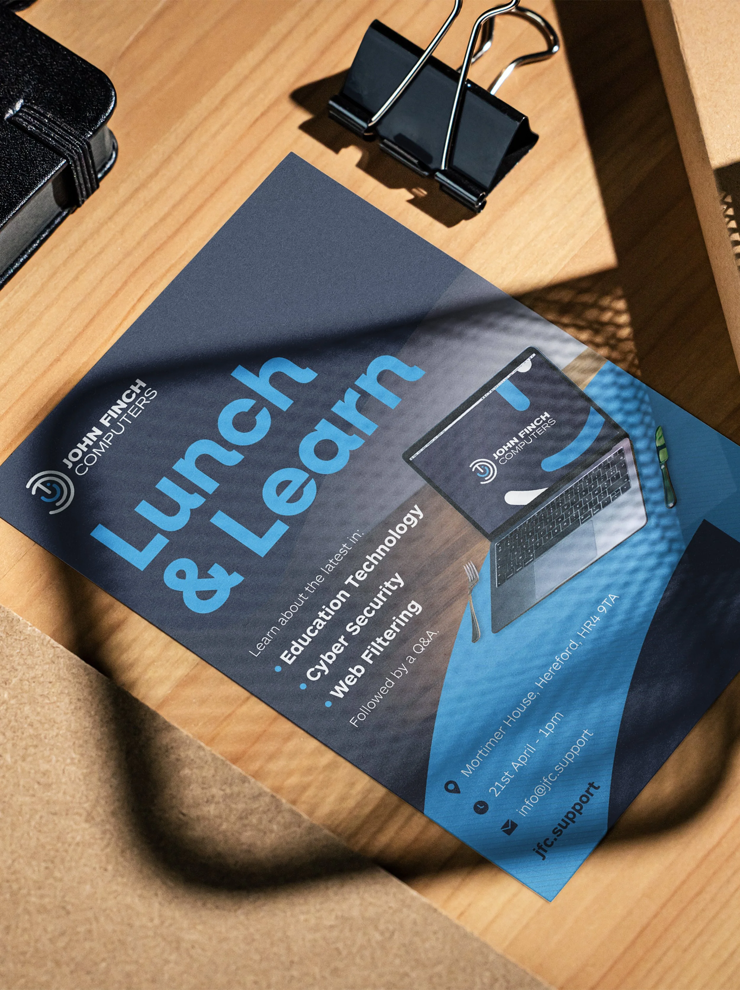
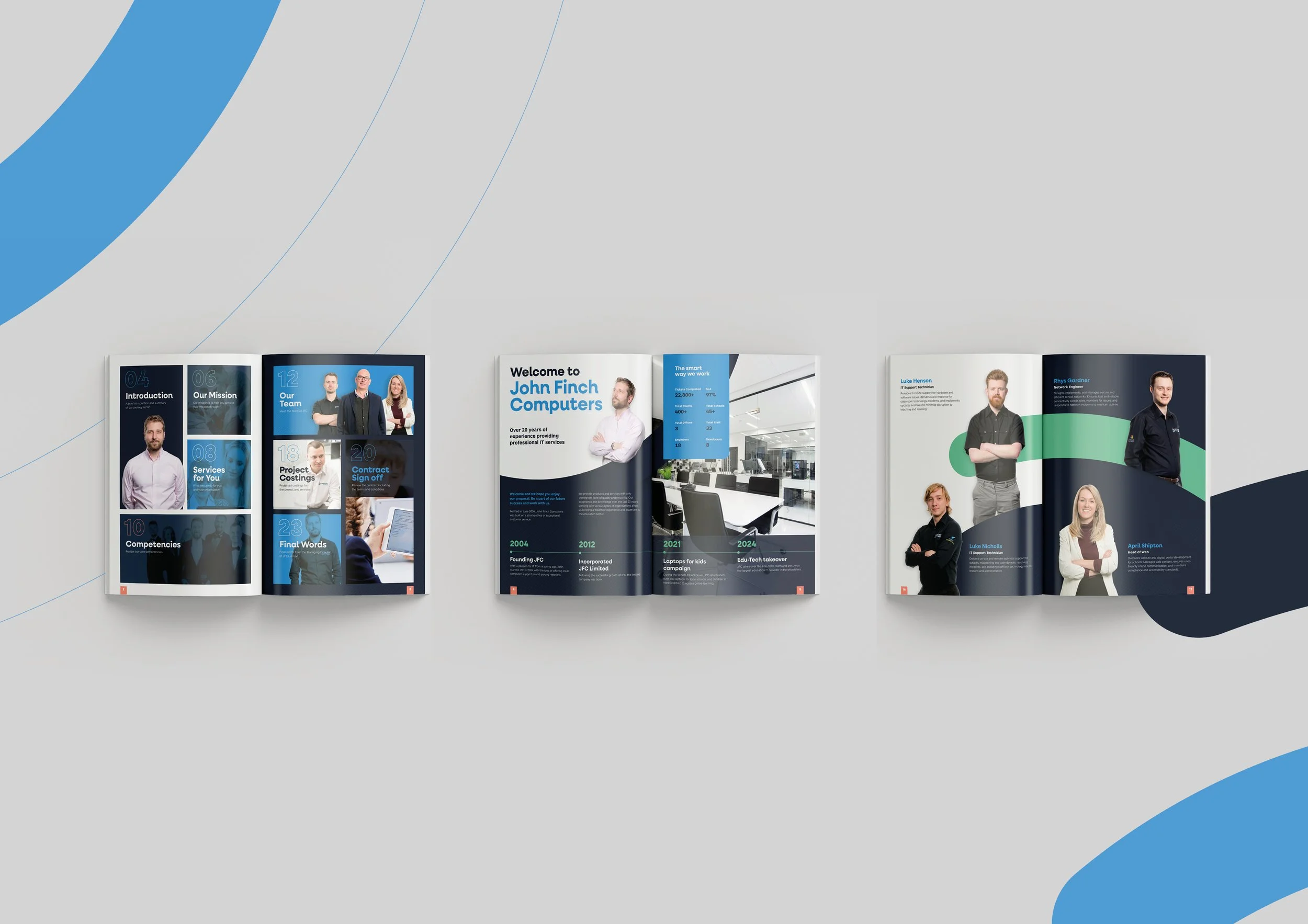
Brochure, Flyers & Stationery
Using the new brand guide as a foundation, we designed a cohesive suite of materials, including a brochure, flyers, business cards, and email signatures, each one built from the same structured system so that every touchpoint felt like part of one unified brand.