Bringing Collingham School’s ethos to life through a thoughtful logo and full brand system.
LOGO DESIGN I BRANDING
Collingham School sought a refreshed brand identity that truly reflected their core values: “We are family; All are welcome; You are loved.” They needed a visual identity that conveyed warmth, inclusivity and care, resonating with students, parents, and the wider community.

The Problem:
Outdated Logo:
The existing logo didn’t reflect the professionalism or warmth of the school, leaving the brand feeling dated and less impactful.
Lack of Visual Identity:
There was no consistent visual system, making it difficult to present a unified, recognisable brand across communications and materials.
Limited Emotional Connection:
The previous design didn’t capture the school’s core values of family, inclusivity, and care, missing an opportunity to connect meaningfully with students, parents, and staff.
The Solution:
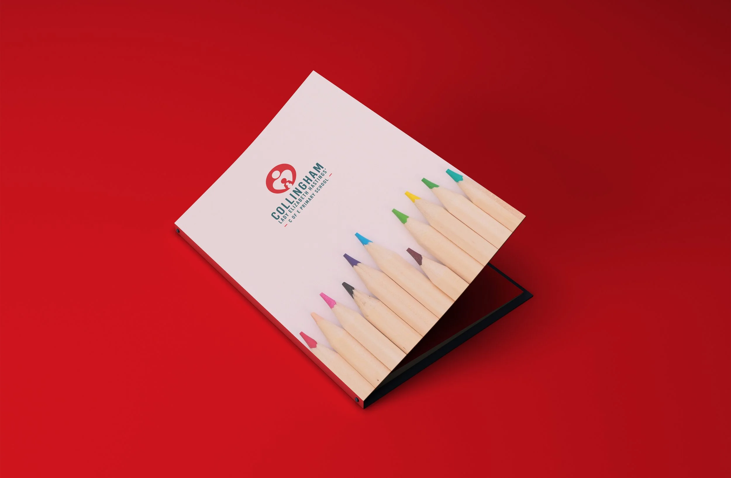
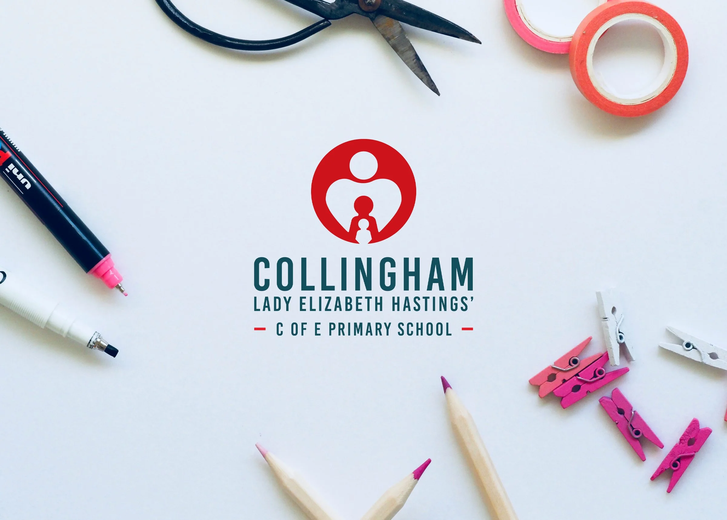
Logo Redesign:
We created a logo with an encompassing circle symbolising safety, featuring three characters. The largest, heart-shaped figure represents care, while the smaller figures reflect family and belonging.
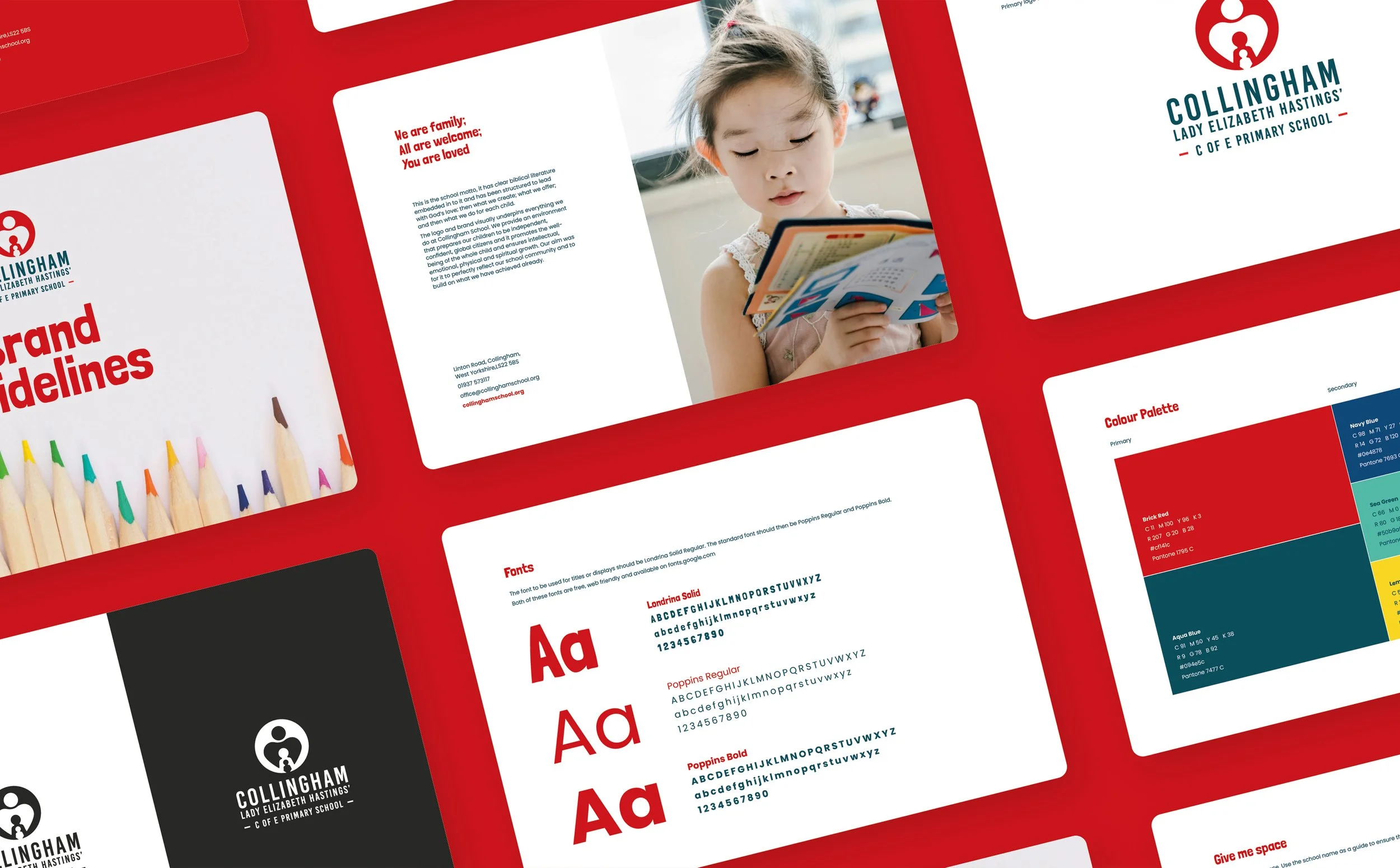
Brand Guide:
A comprehensive brand guide was developed to define typography, colour palette, and imagery, providing clear direction for all future materials.
Consistent Visual Identity:
The brand guide enables Collingham School to apply the logo and visual elements consistently across stationery, signage, and communications, ensuring a professional and cohesive identity.