
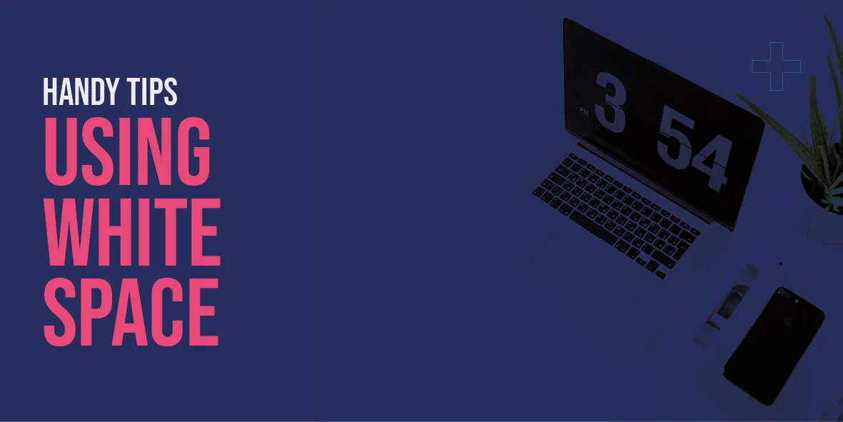
The importance of white space in graphic design.
What do we mean by ‘white space’?
When we talk about white space, we are not talking about colour. We’re actually talking about the negative or empty space you find within the layout of any piece of graphic design or the space between elements such as images, logos, or type. This could be the flat, one-colour space found on an image such as the sky, the spacing around content, or completely empty space to give greater importance to the focal point of a design. This could be used to draw focus to a product or an important piece of information. The poster below is an example. The content or information only takes up about 25% of the space on the page. It’s tempting to fill that space to give greater prominence to the content. Instead, this is achieved through the use of white space. The eye is drawn to the heading and then the essential information below without the distraction of images or graphics.

How to use white space
You don’t need to fill every bit of available space to make an impact. In fact, this usually has a negative effect on legibility and readability. We use white space to give the design room to breathe, draw focus to particular elements such as products and information, or help readability. Without space, the design can end up looking too busy and readers struggle to know what pieces of information on a page are important and how to read a page. If you take Apple as an example, they treat the product as the hero. They allow plenty of empty space around it and keep the text and information to a minimum. By doing this, they are drawing the reader’s attention to the most important element on the page, in this case, the product.

Use space to determine hierarchy
A common mistake is to make all your content important to get your message across. Sometimes you have a lot to say and you don’t want anything getting missed. However, by doing this, all of your messaging becomes unimportant by having equal prominence. I have experience with printed design jobs where I’ve been asked to make lines of text the client felt important bold and bright red to stand out. In the end, everything ended up bold and red, meaning that nothing stood out. This is a rare and extreme example but it gives you an idea of how being selective about which pieces of information are important to get across your key messaging. By giving the essential information plenty of space, you draw people’s attention to that content and also give it greater importance.
Use space to affect style
If you think about the feel or style of any piece of graphic design, the amount of white space has a dramatic impact on the feeling of quality. The most obvious examples of this are in product advertising. Think about leaflets you may get through the door with hundreds of images, bold flashy prices and tightly packed content. The important message those companies are trying to get across is that they are the place to go for low prices and value. The reason design such as this looks to be of lower quality is the idea that leaving blank space is a waste and therefore not economical.
Compare this with companies with more high-quality products on offer. They are usually generous with white space, almost as if the products on offer are so high-end that they can afford to ‘waste’ space without the need to fill it. This technique also gives greater emphasis to their product and makes them aspirational in the way Apple achieves this in the image above.
Below are examples from Tiffany and Aldi. By keeping content to a minimum, Tiffany places greater emphasis on quality and exclusivity. This makes it an aspirational product. Aldi uses up all available space with an emphasis on the number of products and prices. This gives readers the impression that they can get a lot of ‘bang for their buck’. These aren’t examples of good or bad graphic design but instead, show how white space can affect the style and the impression customers can be left with.

Summary
White space isn’t just empty space that needs to be filled. It can be used to create clearer content, hierarchy within a page, and affect how your design feels in terms of quality. Essentially white space is just as important as the rest of the content in terms of driving style, getting your message across and affecting readability.