
The science of design
Design is subjective, right?
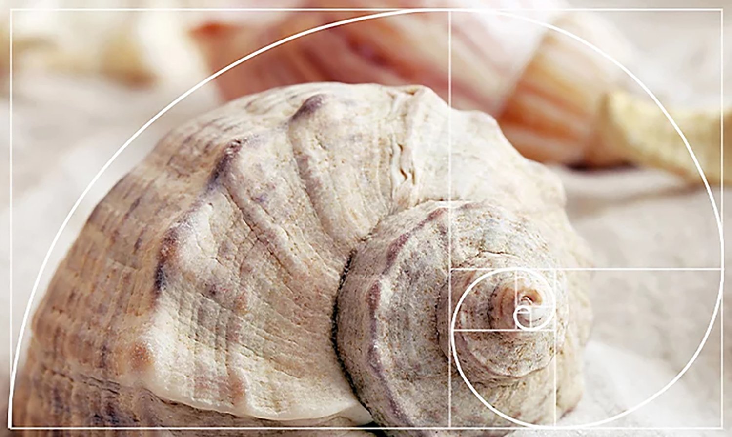
Not entirely. On the surface, design is artistic and purely visual, but the process is about problem solving and the solution requires the ability to manipulate. On some levels graphic design is an art form, and a piece of design is subject to opinion and taste. But graphic design is not meant to be hung on a wall and admired. It has a function, and ultimately solves problems. Graphic design usually works within a commercial framework where its role is to encourage people to buy products, heed warnings or change opinions. Design can be beautiful and visually pleasing, but there is often science behind achieving even this outcome, such as the golden ratio. Often thought to be an aesthetically pleasing shape due to its common occurrence in nature.
The Von Restorff Effect
Also known as the ‘isolation affect’, this proven psychological theory by female behavioural scientist Hedwig Von Restorff, is the idea that anything that stands out from the crowd will be more memorable. In design this has obvious applications. In e-commerce websites, for example, it can draw users to click on the ‘buy’ or ‘add to basket’ buttons by using distinctive colours. You only have to browse on Amazon to realise the majority of the content is black on a white page, while those buttons are bright orange.
From a branding point of view, bucking the trend and looking to try something new can help your business to stand out from the crowd, which in turn helps you to stick in peoples minds and be memorable. This is not without risks and needs to be done in the right way to suit your business, while still appealing to your target audience. Playing it safe and fitting in with the crowd isn’t actually as safe as it sounds, and the risk of blending into the background and being forgotten is often greater.

Colour psychology
Most people know that different colours can evoke different emotions and moods. In design this is an important tool to be aware of. Below is a rough guide on how each colour can affect the perception of your business or organisation.
White: Purity, innocence, cleanliness, sense of space, neutrality.
Blue: Secure, calm, honest, trustworthy, strong, caring
Red: Energy, love, exciting, action, bold, passionate
Yellow: Logical, optimistic, forward-thinking, confidence, playful
Purple: Imaginative, creative, nostalgic, wealth, wisdom
Green: Growth, organic, natural, caring, fresh, earth
Black: Sophistication, luxury, seductive, formal, authority
Shape psychology
As with colour, shapes also have their own characteristics and trigger different emotional responses. This can be shapes in the purest sense such as:
Circles and rounded shapes: Unity, community, friendship, love and femininity
Squares and Triangles: Stability and balance, strength, professionalism, power and masculinity.
Vertical Lines: Strength, and aggression.
Horizontal Lines: Tranquility and calm.
Shape theory is not just limited to block shapes. If you think about fonts as intricate shapes, they too have all the same characteristics. In the same way that rounded shapes can have a friendly look and feel, or pointed triangles can evoke power, fonts with rounded loops or pointed descenders can have the same effect.
Cost-benefit analysis
This is a daily process encompassing all areas of our lives. Is the cost of what I’m doing worth the potential benefits? In design for example, this could simply be how easy a form appears to be to complete, in relation to what the user is getting out of it. Users won’t fill in a five page form where they have to divulge private information, or give out every detail regarding their interior design preferences in exchange for a carpet sample. In other words, the cost outweighs the benefit. In design we can apply this to areas such as a website form, by ensuring the requested details are kept to an absolute minimum. The layout of a form can also be designed in a clear way. On longer forms we can provide visual clues as to what stage the user is at, and how many more steps there might be before completion. This reassures the user that the end is near and there won’t be any added steps.

Directing the viewers eye
How do you want your page or screen to be read, where do you want the reader to look first and what is the most important thing for them to look at and pay attention to? Most people will scan a page beginning at the top left. Colours and graphics can then be used to guide a viewer. We can use obvious graphics such as arrows and even labels to simply tell a website user to scroll. But here we’re really talking about subtle visual clues and colours. Bold colour, large fonts and even faces can be used to attract the eye and help viewers to focus on the important information, and read a page in the correct order. Our brains are wired to seek and recognise faces, and in particular the eyes. We can even use the eyes in those images to direct where the viewer moves to next, encouraged to do so by the direction of their gaze.
We can even elevate the aesthetic appeal of a piece of design by keeping a viewer engaged in a piece of design. One way we can do this is by using the same colour at the top and bottom of a page. Before the eye ‘drops’ from the bottom of a page it will be drawn to that familiar colour. This then ‘bounces’ the eye back to that same colour at the top of the page. This perpetual cycle keeps the eye on the page longer, meaning the reader takes in the design for longer, which in turn makes the design more appealing.

Summary
On the surface, graphic design can be subjective and open to opinions. By digging a bit deeper and understanding the science and the process, it is clear that the majority of decisions taken throughout any design project are objective, and chosen to solve a problem or provide effective solutions that lead to tangible benefits for businesses and organisations. An experienced designer will make these decisions instinctively, drawn on years of their own observations and experiences. All designers strive to make visually appealing work, but this must be based on objective decisions and sound reasoning. Form follows function.